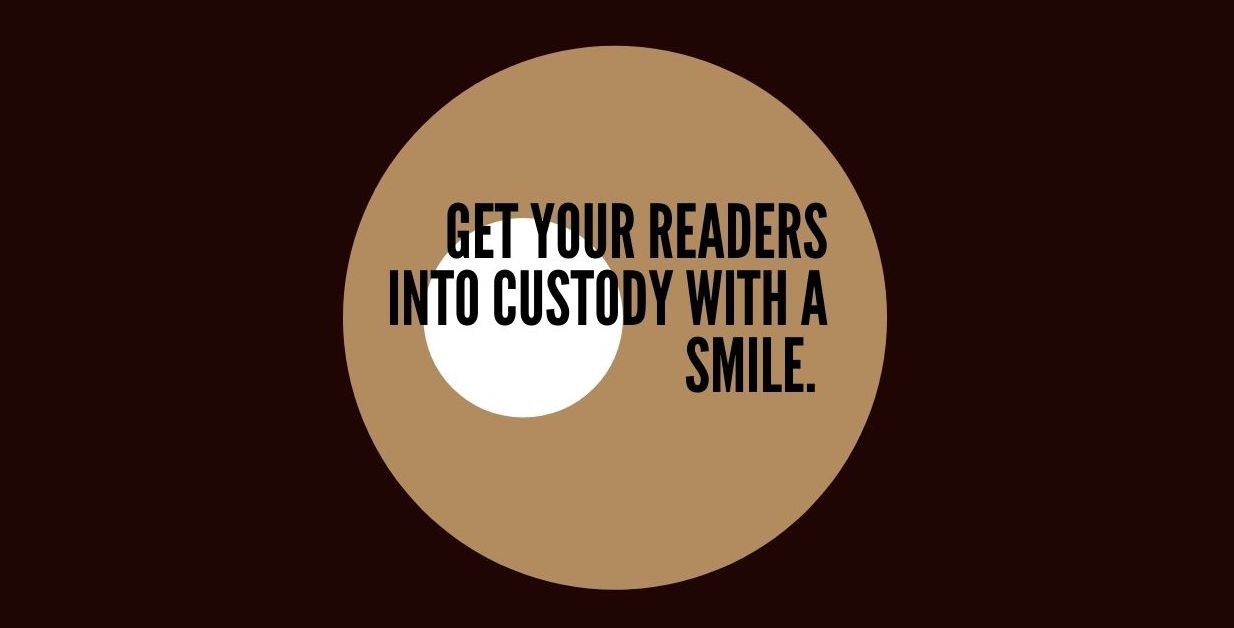
Help people read your stuff.
What if I shared 3 quick tricks tips that could get your email list into trouble? Legally, I mean. But could, at the same time, skyrocket your readability.
Would you do it?
A few years ago, when we had our real estate company, our brand director wanted everything to look as freakishly neat as the Trump Tower’s lobby.
Font, format, size, graphics.
Every email looked like the Mona Lisa (a painting considered an archetypal masterpiece of the Italian Renaissance) of copy. He couldn’t care less about (what I realise now) matter the most…
Consumption.
People do or do not read your stuff is the only question you should ask.
Because if they don’t, what’s the point of you spending hours writing out your thoughts if nobody actually reads your stuff?
Help people read your stuff.
That *is* the only thing you should care about.
This happened…
Someone from my list was skimming ferociously (no kidding) on his phone one of my emails while waiting at a traffic light, heard a knock, and screamed, “I swear officer… I wasn’t?!?”
That’s how powerful my emails are.
Nah… just kidding.
Still, here are 3 quick tips I’ve learned from sending out roughly 1.7 million emails per month:
#1: Make sure it looks like an email — not a death wish list!
Obvious? Still, most businesses send boring emails, with boring titles, and boring content. But businesses are made of people. And people don’t like “boring”. So loosen up a bit.
#Be Human. Don’t be boring.
#2: Remove all graphics — except you Trevor!
Unless you are a real estate agent who needs to showcase a house or a photographer who needs to share his work or Trevor Noah and want to post a screenshot of your text messages…
#Use graphics sparingly. Only to make a point.
#3: Make it easily scannable — on mobile!
Most people read skim through their inbox on their phones. Don’t make people’s lives harder.
#Make your emails easy on the eye.
The secret to good emails IMHO?
Short sentences (.)
Lots – of – the – line – breaking
Bullet ● ● ● ● points
Se/ct/ions… when you writing about 1..2.. 3 reasons
Clean & simple font